DocBox
One app for every document
Role:
UX/UI Design
Platform:
Android
Tools:
Figma
Role: UX/UI Design
Platform: Android
Tools: Figma
Overview
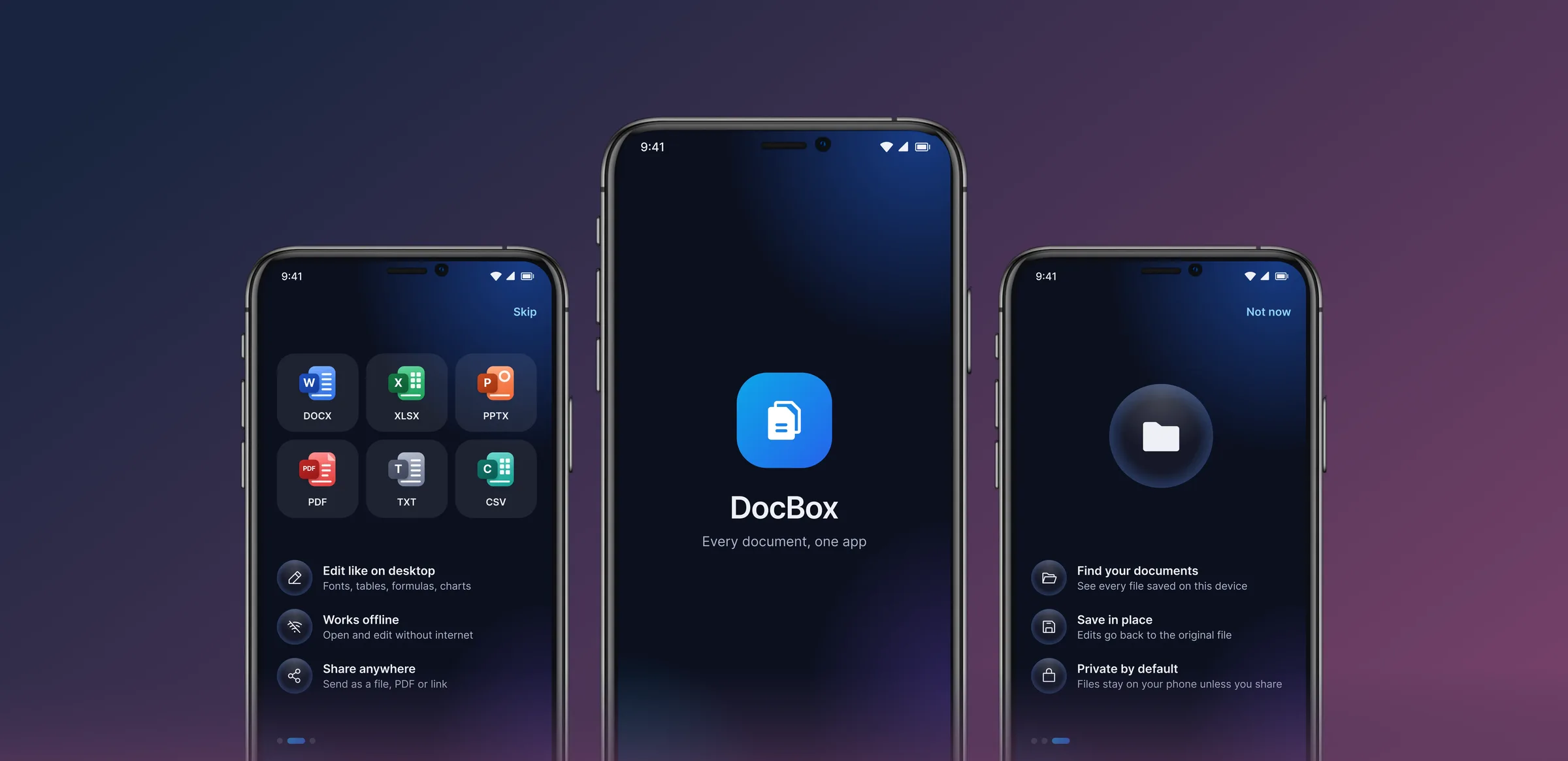
DocBox is an Android app for opening, editing and organising Word, Excel, PowerPoint, PDF, TXT and CSV files in one place. I designed the full experience: multiple flows, 50+ screens, dark and light themes, and the design system behind them.
The Challenge
People switch between separate apps for documents, spreadsheets, slides and PDFs, and most of them feel heavy on a phone. The goal was one calm app that handles every format, works offline, and stays out of the way.
One calm app that handles every format — and stays out of the way.
Goals
- One app, every format: Provide a consistent editing experience across DOCX, XLSX, PPTX and PDF.
- Fast to start: Let people open, search or create a file in a tap or two.
- Private by default: Keep files on the device unless the user connects a cloud account.
- Comfortable in any light: Support focused work with dark and light themes.
Design System
A shared foundation gives the growing app a clear, consistent visual language.
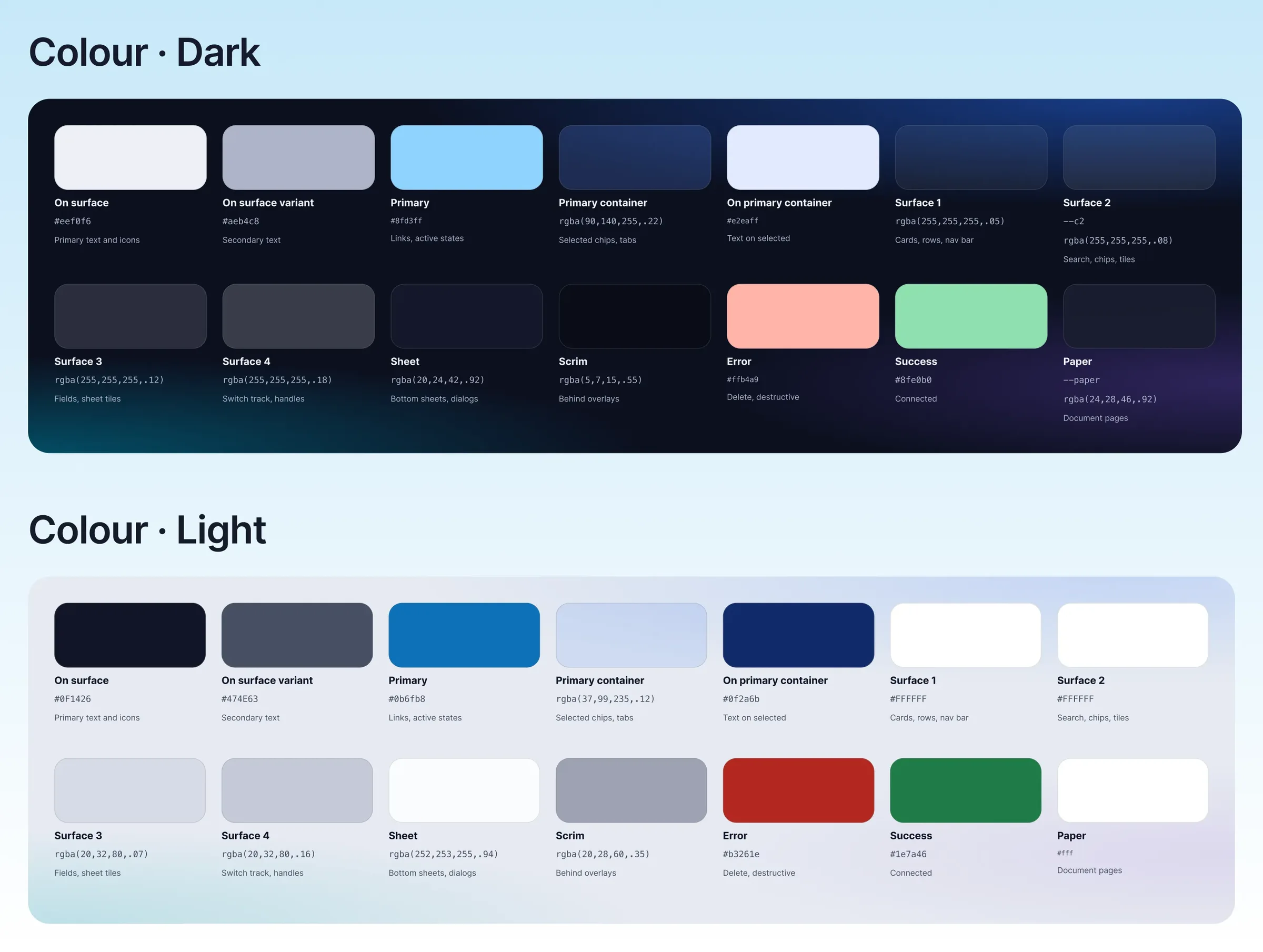
ColourSemantic tokens (surface, primary, error, success) mapped across both themes. A blue gradient is reserved for primary actions.
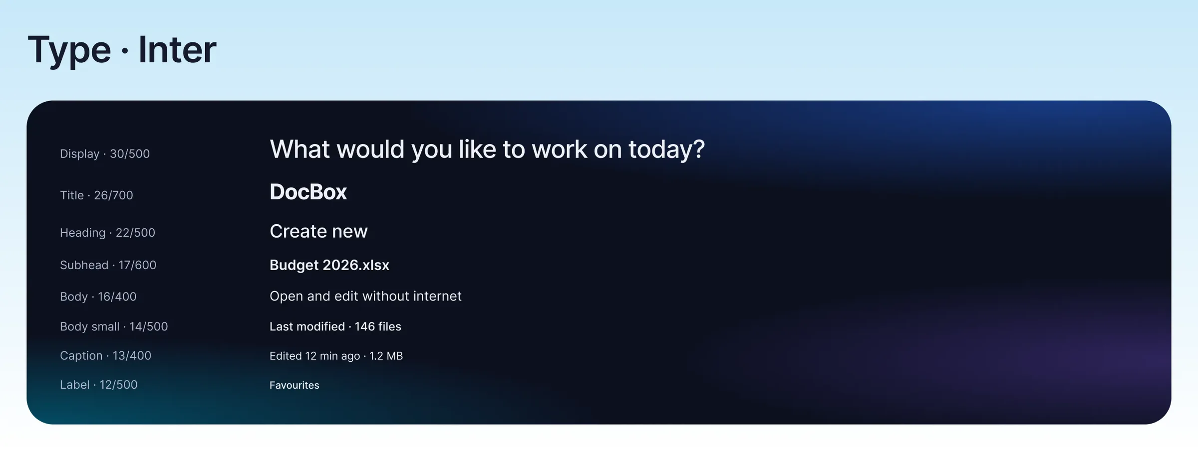
Inter keeps interface text clear, with seven sizes ranging from 30 px display text to 12 px labels.
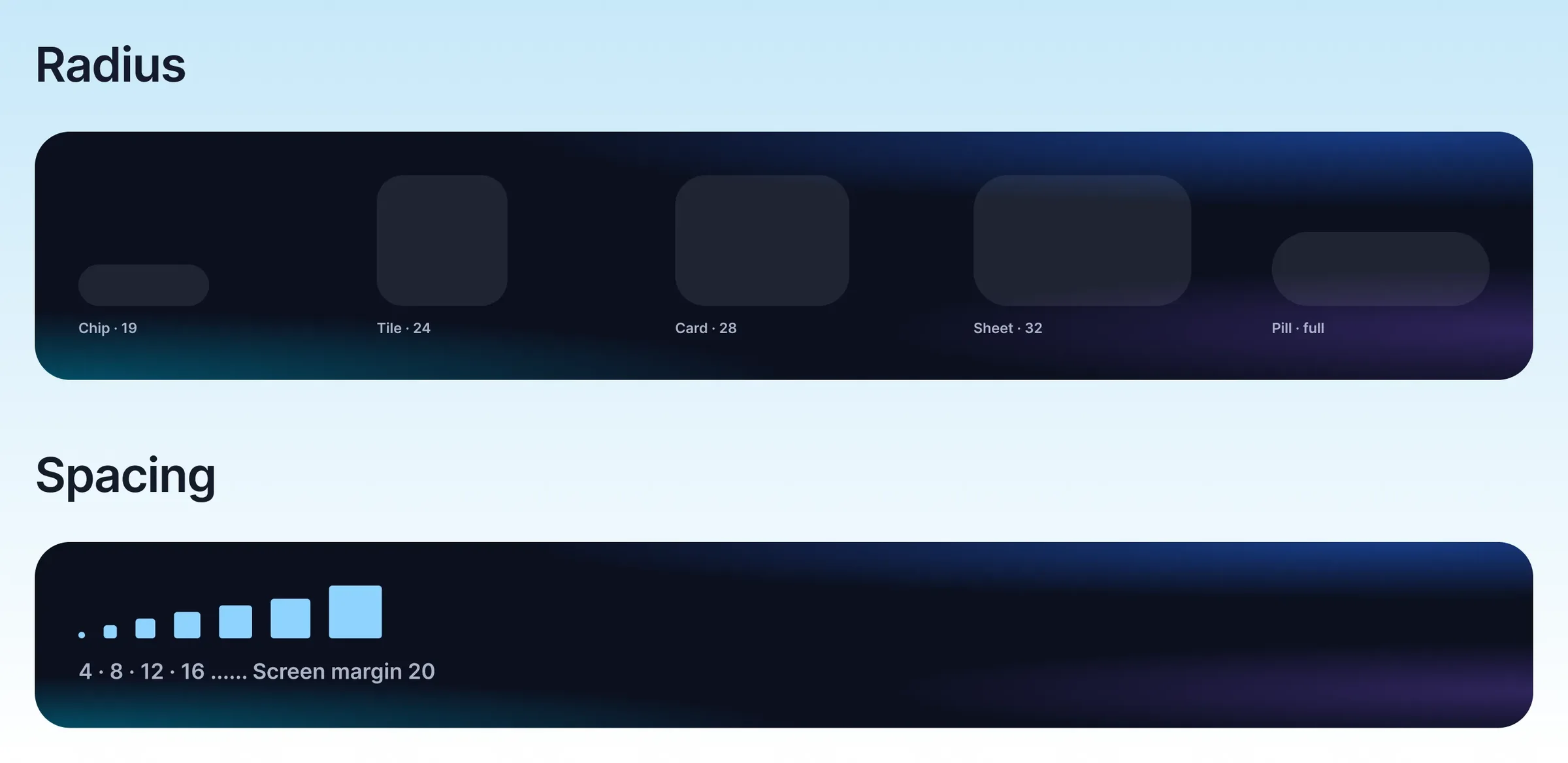
Four corner treatments give cards, controls and sheets a consistent shape. A 4 px spacing scale creates a steady rhythm, with 20 px margins framing each screen.
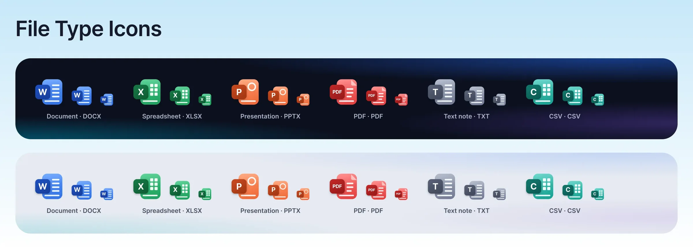
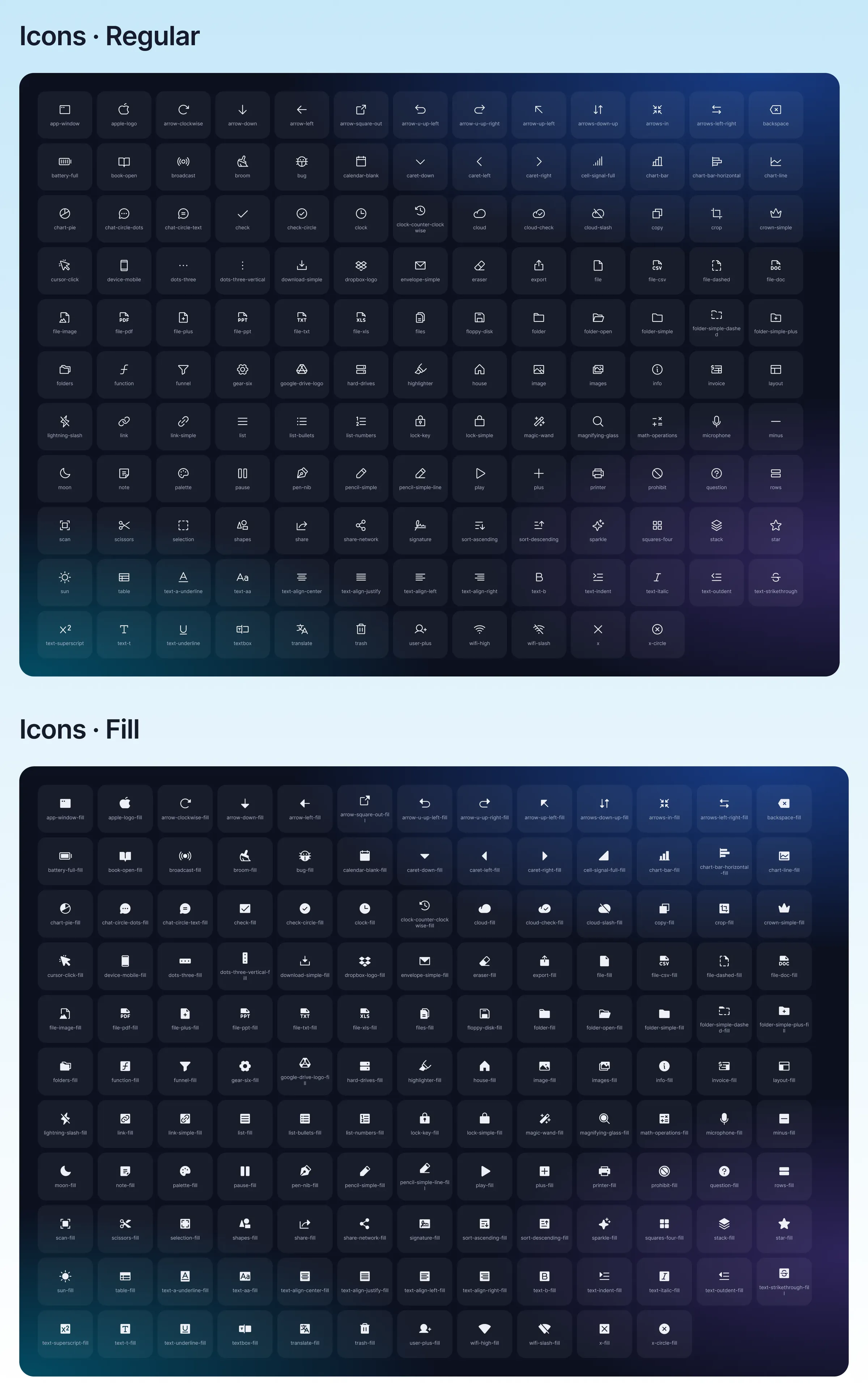
Multiple icons in regular and fill styles, plus custom colour-coded file type icons for each format.
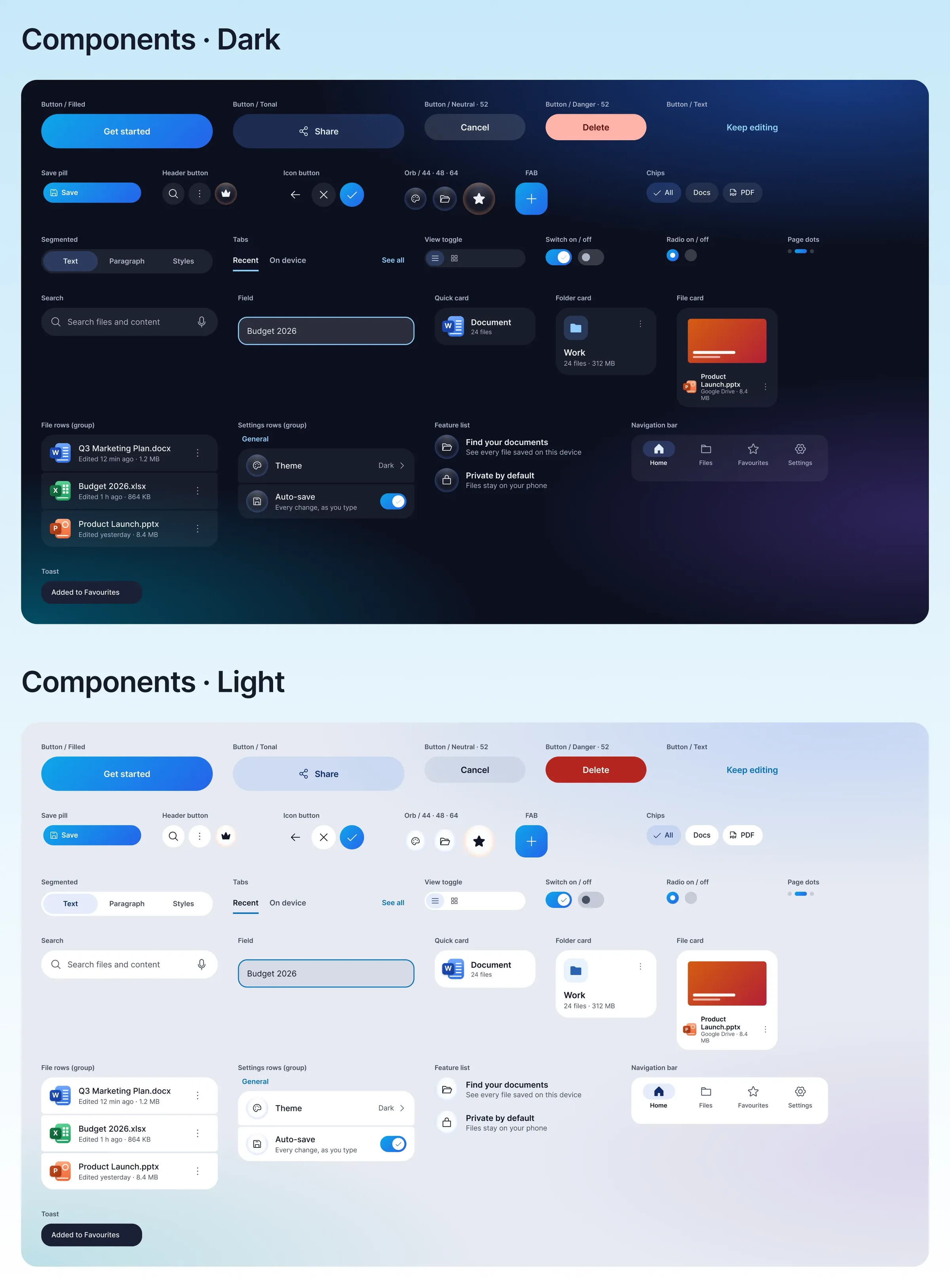
Buttons, chips, tabs, segmented controls, file and folder cards, bottom sheets, dialogs, toasts and navigation — each designed for both themes.
Key Flows
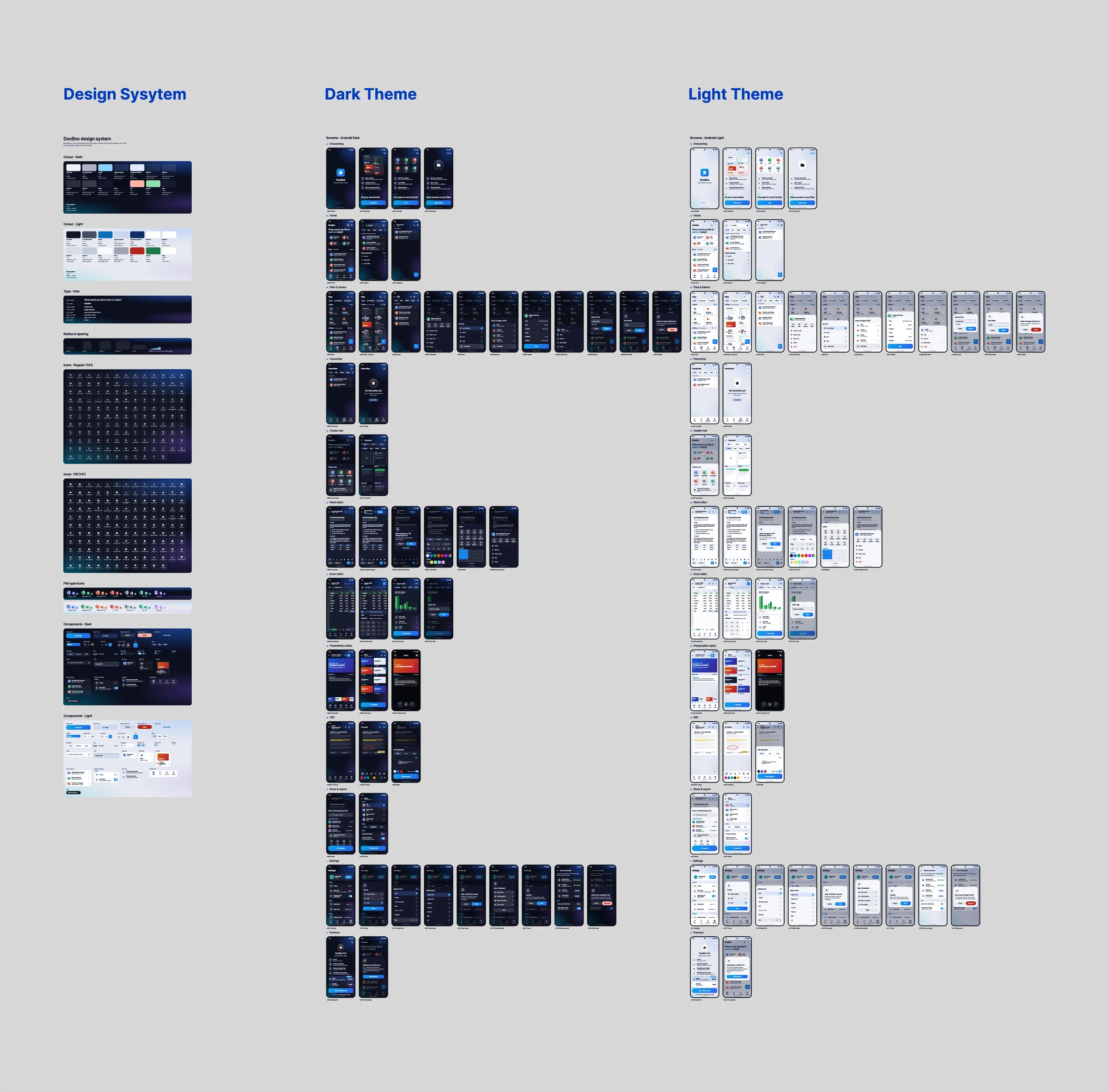
The app is organised into multiple flows that follow how people actually use a document app: get started, find a file, create or edit it, then share it or manage settings. Each flow reuses the same components, so moving between Word, Excel, Slides and PDF feels familiar.
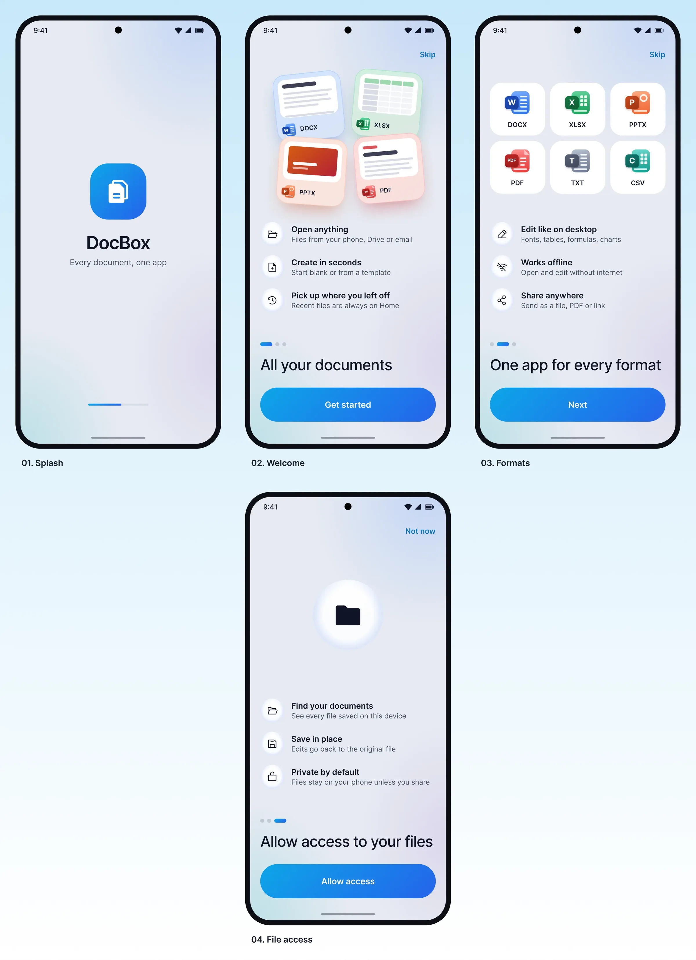
Three short screens explain the app, followed by a clear file-access request.
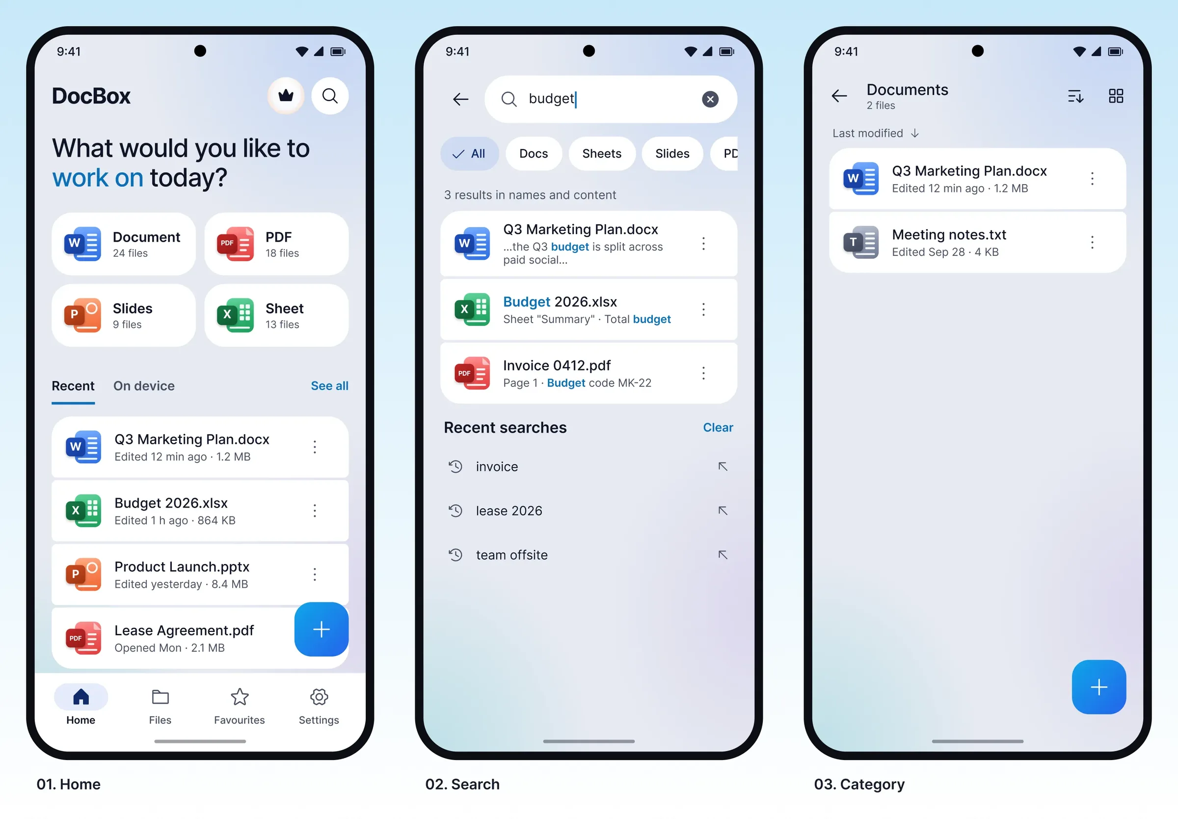
Quick-access tiles by file type, recent files, and search across names and content.
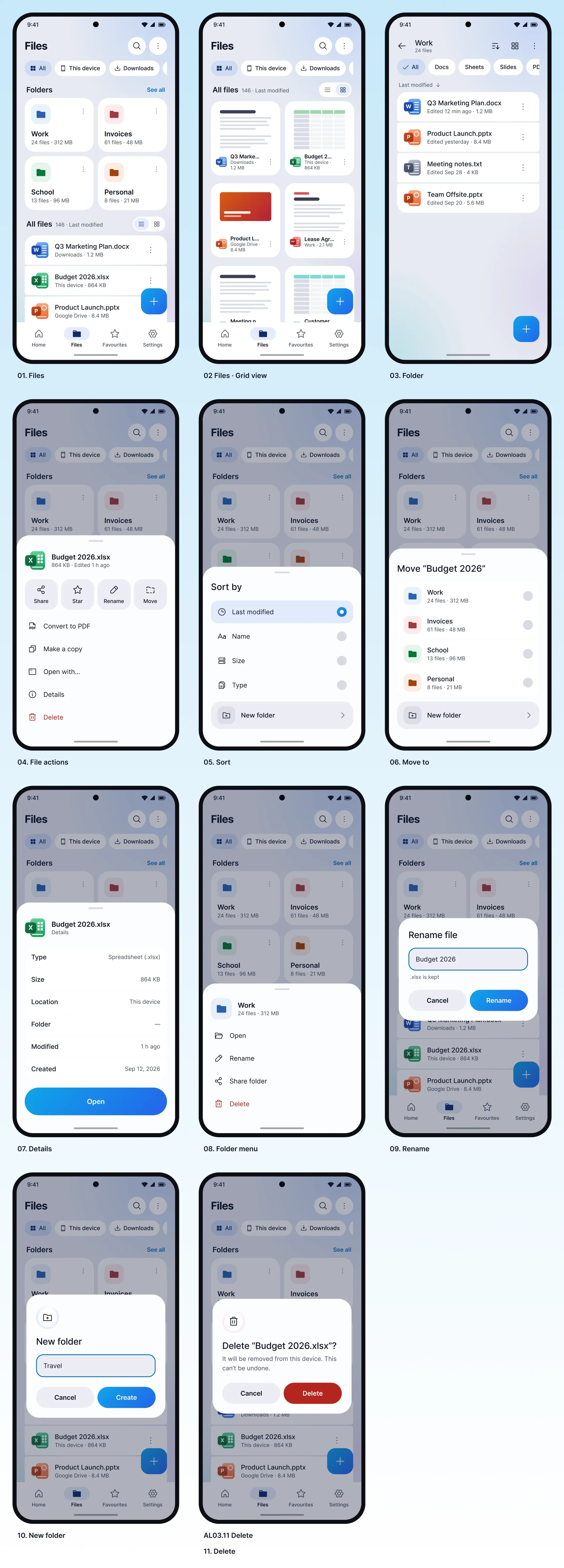
Browse documents in list or grid view, sort them, and organise them into folders. Move, rename or delete items through clear menus and dialogs.
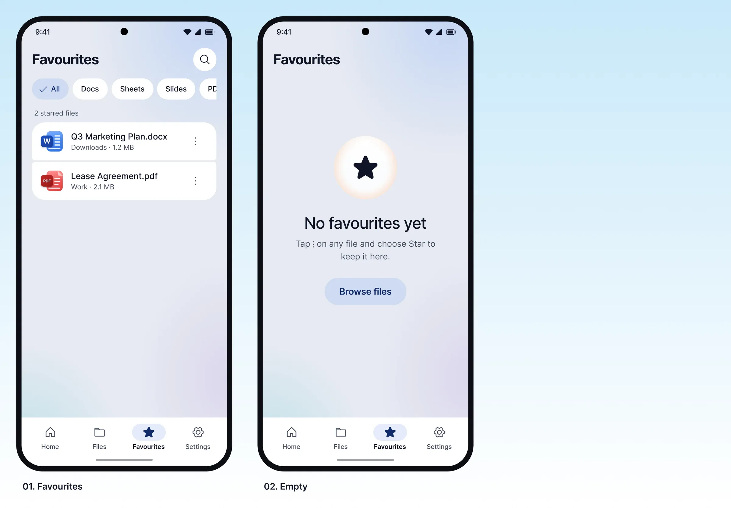
Keep important documents close at hand by marking them as favourites.
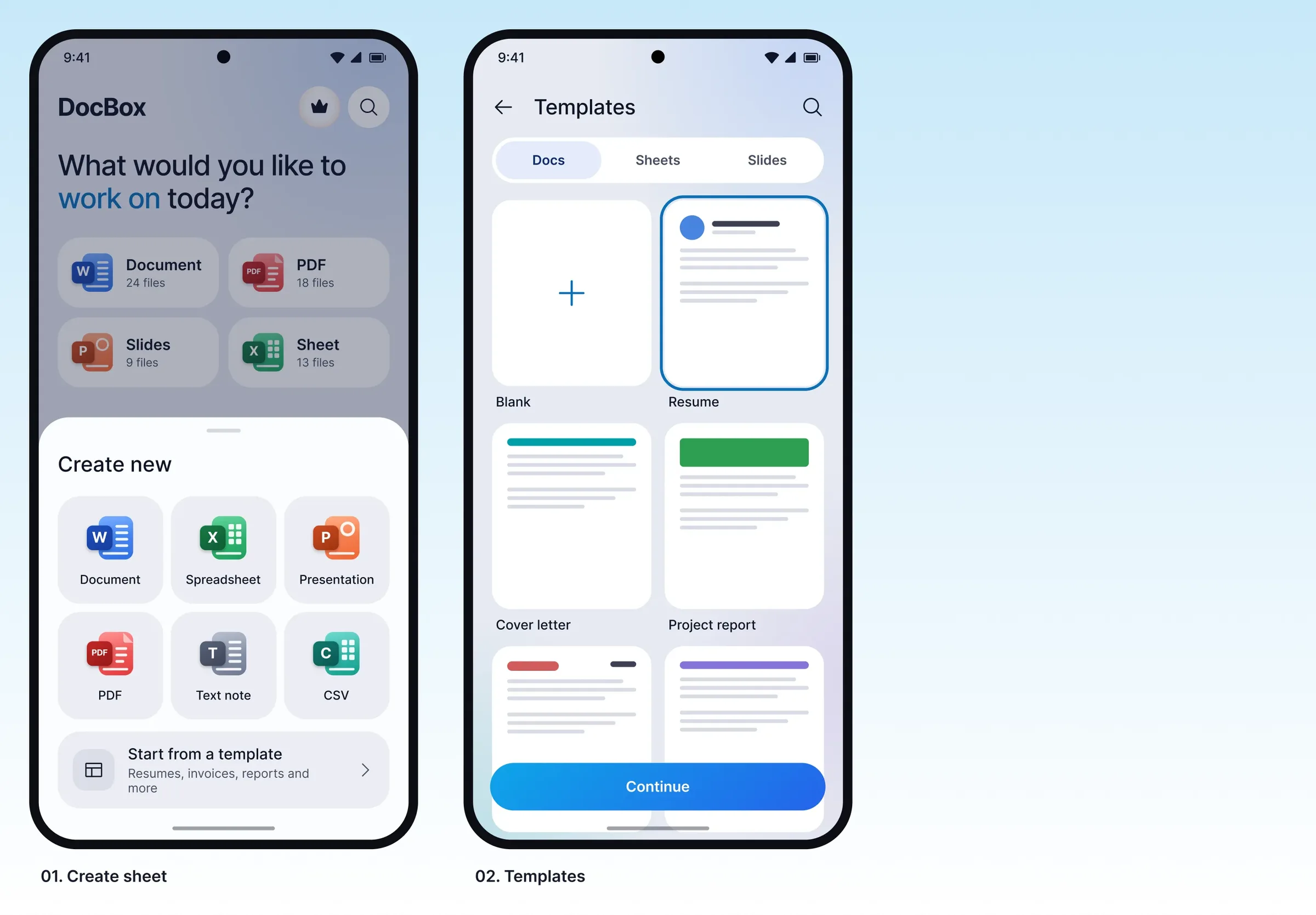
A create sheet with templates for documents, sheets and slides.
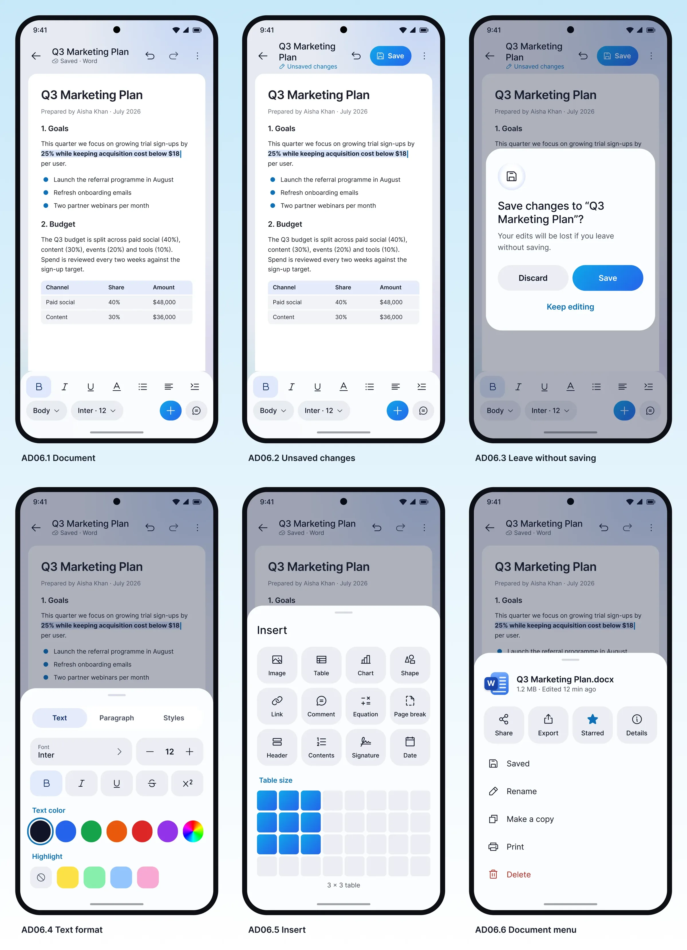
A focused writing space with a text-format panel and an insert menu.
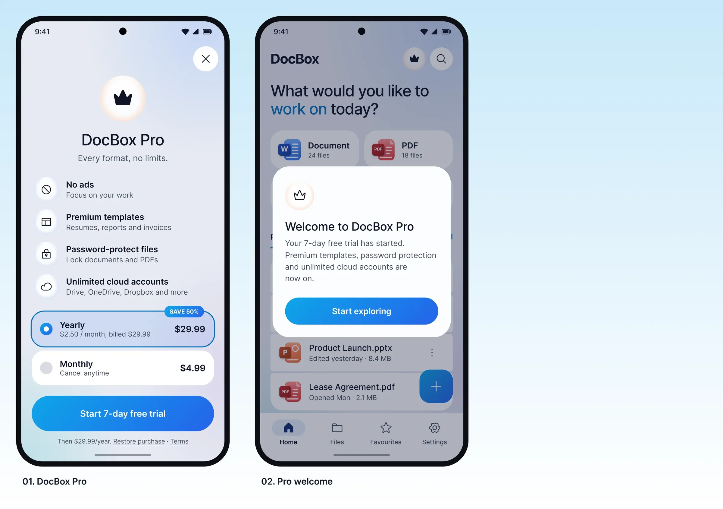
Theme, default font, spell check and cloud accounts, plus a simple premium upgrade flow.
Outcome
A complete design of 50+ screens in two themes, built on a reusable system that makes new screens faster to design and easier to hand off.
What I Learned
Designing DocBox taught me that a strong system is what keeps a large app consistent. Setting colour, type and spacing first, and designing dark and light themes together, kept 50+ screens aligned with very little rework.
I also learned that dense tools like Word and Excel work best on mobile with simple patterns such as bottom sheets and compact toolbars, and that small details like empty states and confirmations are what make an app feel complete.